<style> #title { height: 100% !important; display: flex !important; flex-direction: column !important; justify-content: center !important; } </style> <section id="title" data-background="/images/presentations/bg.svg.png" data-transition-speed="slow"> # Speaking visually: principles of communicating through data visualization Nathan Sheffield <div class="bullet"> <img src="/images/external/uva_dgs_logo.svg" height="85"> <img src="/images/logo/logo_databio_long.svg" height="65"> </div> <span style="font-size:0.6em"><a href="http://www.databio.org/slides">www.databio.org/slides</a></span> </section> --- ## What is communication? > The two words 'information' and 'communication' are often used interchangeably, but they signify quite different things. > Information is giving out; communication is getting through. > -Syndey J. Harris, For the Time Being, 1972. Note: - Today's goal is to introduce a philosophical framework for communication, and then 5 specific principles of applying that philosophy to data visualization can improve our communication. --- ## Tollbooth syndrome  Note: - Gopen's Tollbooth syndome: It's 1980. After a grueling 15-hour day consulting in Manhattan, you're driving back to Connecticut in wind and rain. Near midnight, exhausted and frustrated, you approach a tollbooth on I‑95. The sign reads: _Toll booth ahead – 40¢ – exact change – left lane._ You dig through your pocket and find a quarter, a dime, and a nickel—exactly what you need, the first stroke of luck you've had all day. You choose the exact change lane. You toss the coins into the hopper: the quarter and dime fall in. The nickel bounces out. Now what? Do you get out in the cold rain to search the gravel? Back up and switch to a lane with a human who can make change for your dollar? Or do you drive through the red light, telling yourself: _"I paid the toll—I gave up 40¢."_ Most people choose the last option, rationalizing that they've been dispossessed of the money. But if you do that, you've misunderstood the point of the toll. Its purpose isn't just to separate you from your 40¢. Its purpose is to _transfer_ that money to the state—to register the payment, to maintain the road. - **The point:** Writers often do the same—they assume that because they _intended_ to communicate, or gave up the information, the reader received it. But unless the meaning lands—just like the coin—it doesn't count. - Source: *Misconceiving the writing task: The toll booth syndrome*. Gopen GD. 2014. *Litigation*, 41. --- ## Communication is getting through You can understand your message perfectly, but if you don't understand the mind of the message receiver, it won't get through. Messages must be crafted in the context of their recipients. <!-- .element: class="fragment" --> Note: - So: the question is, how do we get throught? How do humans understand communication? - A bit of psychology can help... --- ## Cognitive load theory **Cognitive load**: The amount of mental effort used in working memory during learning or problem-solving. - Like a computer, your working memory can hold only a limited amount of information at once.<!-- .element: class="fragment" --> - The demands on your brain's processing capacity are called cognitive load.<!-- .element: class="fragment" --> - High cognitive load can overwhelm working memory, making it harder to learn.<!-- .element: class="fragment" --> --- ## What affects cognitive load? - **Intrinsic Load**: The inherent difficulty of the material itself. - **Extraneous Load**: The mental effort imposed by how information is presented. - **Germane Load**: The effort involved in processing, constructing, and automating mental models. This is the "good" load that helps learning. Your goal is to reduce extraneous load.<!-- .element: class="fragment" --> Note: - Get the person to understand your point with as little energy as possible. - So: the question is: how do we reduce extraneous load? --- ## 5 ways to reduce cognitive load 1. Make comparison easy. 2. Strip away clutter. 3. Convey a single point. 4. Fit the message to the audience. 5. Build visual rhythm. Note: 1. Make comparison easy: Leverage human perception: Match the easiest comparison to make with the point you intend to communicate. 2. Strip away clutter. Economy of Information: Maximize Data–Ink Ratio (Tufte) 3. Convey a single point. Focused Intent: Optimize the plot to make a single key point. 1. A chart should not just show data—it should highlight what matters. 4. Fit the message to the audience: Use the right level of detail (know thy audience). Cartoons, etc 5. Build visual rhythm. Consistency (familiarity) 1. small multiples (consistency within a panel) 2. across plots, with colors/icons --this helps the viewer immediately understand --- ## 1. Make comparison easy Leverage human perception: Match the easiest comparison to make with the point you intend to communicate. --- ## 1. Make comparison easy  Note: Making your plot so that the key comparison requires the least cognitive energy. The one on the left makes the relevant comparison harder. Example from book (need to remind myself of the title). --- ## 2. Strip away clutter Economy of Information: Maximize Data–Ink Ratio --- ## 2. Strip away clutter  <!-- .element: class="fragment" --> Note: Clutter/chartjunk/extra ink distract from the message, increasing cognitive load. These are from Tufte's book Envisioning information. The thick black lines create this double-grid, where the thing that stands out the most is the white dots at the corners due to a moiré effect --- ## 2. Strip away clutter 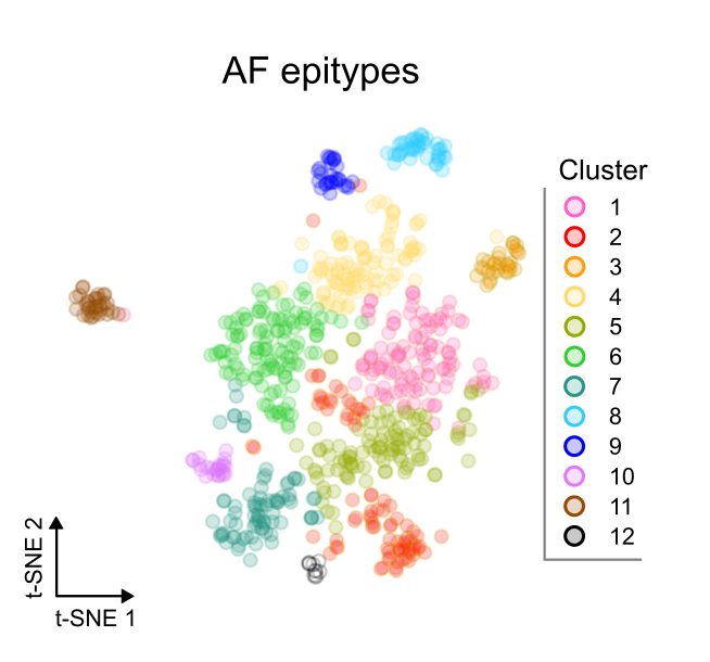 Note: Here's an example of trying to get pretty simple. --- ## 2. Strip away clutter 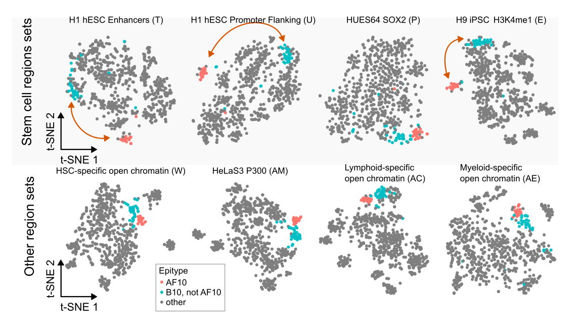 Note: Another example --- ## 3. Convey one main point per panel Focused Intent: Optimize the plot to make a single key point. Note: Related to stripping away clutter; but the point here is to try to isolate what you're trying to say into specific figures. --- ## 3. Convey one main point per panel 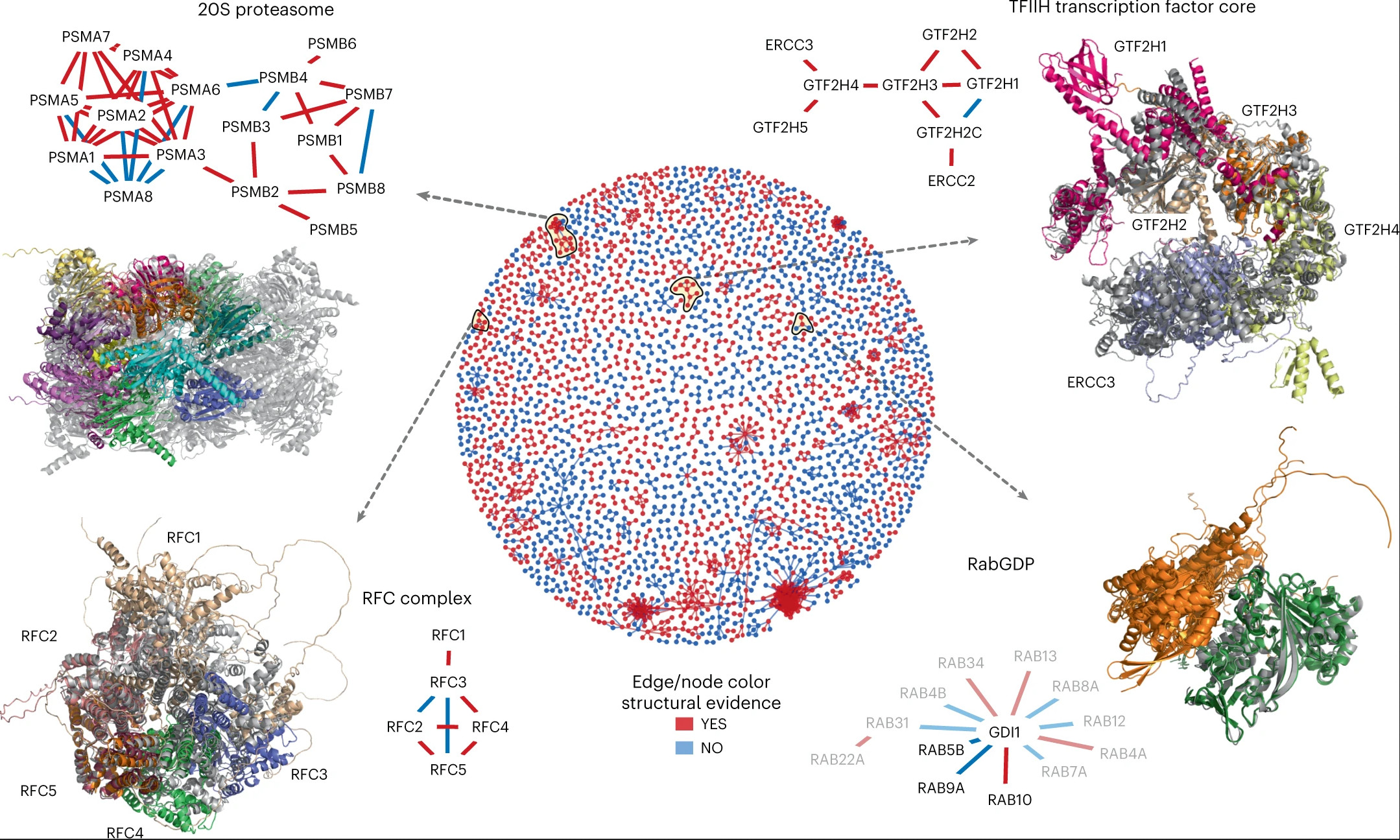 Note: Example of a huge figure that's doing multiple things. How will you reference this in the text? Where should the reader focus? --- ## 3. Convey one main point per panel 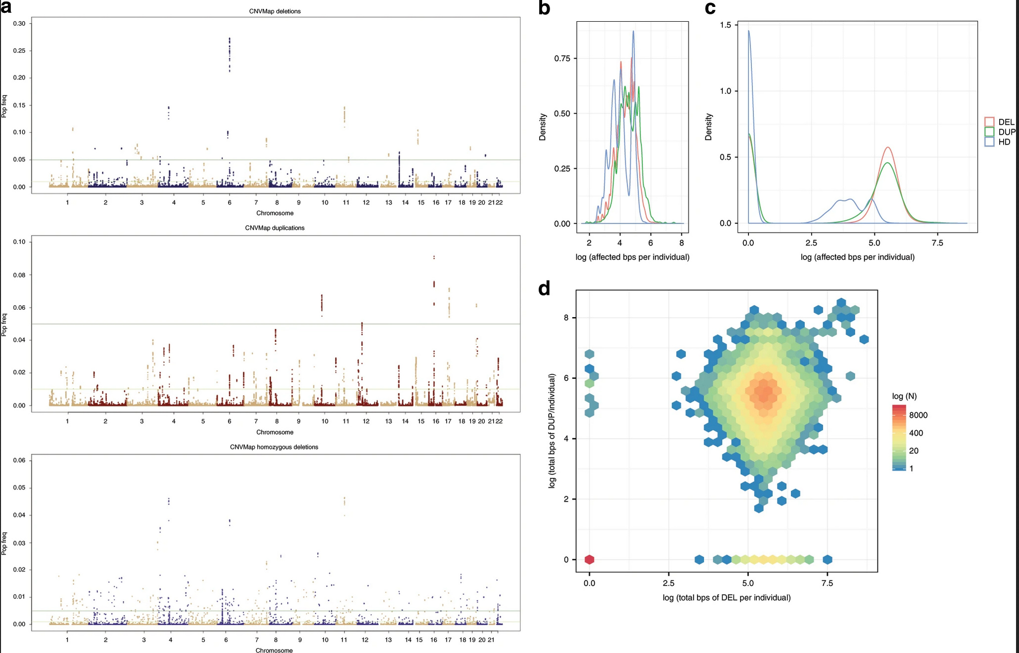 Note: In this example, three huge plots get a single panel label. This allows you to reference all 3 using only one handle. This may be OK, but then I'd argue, if you are only making a single point, is this really the right way to show this? --- ## 3. Convey one main point per panel 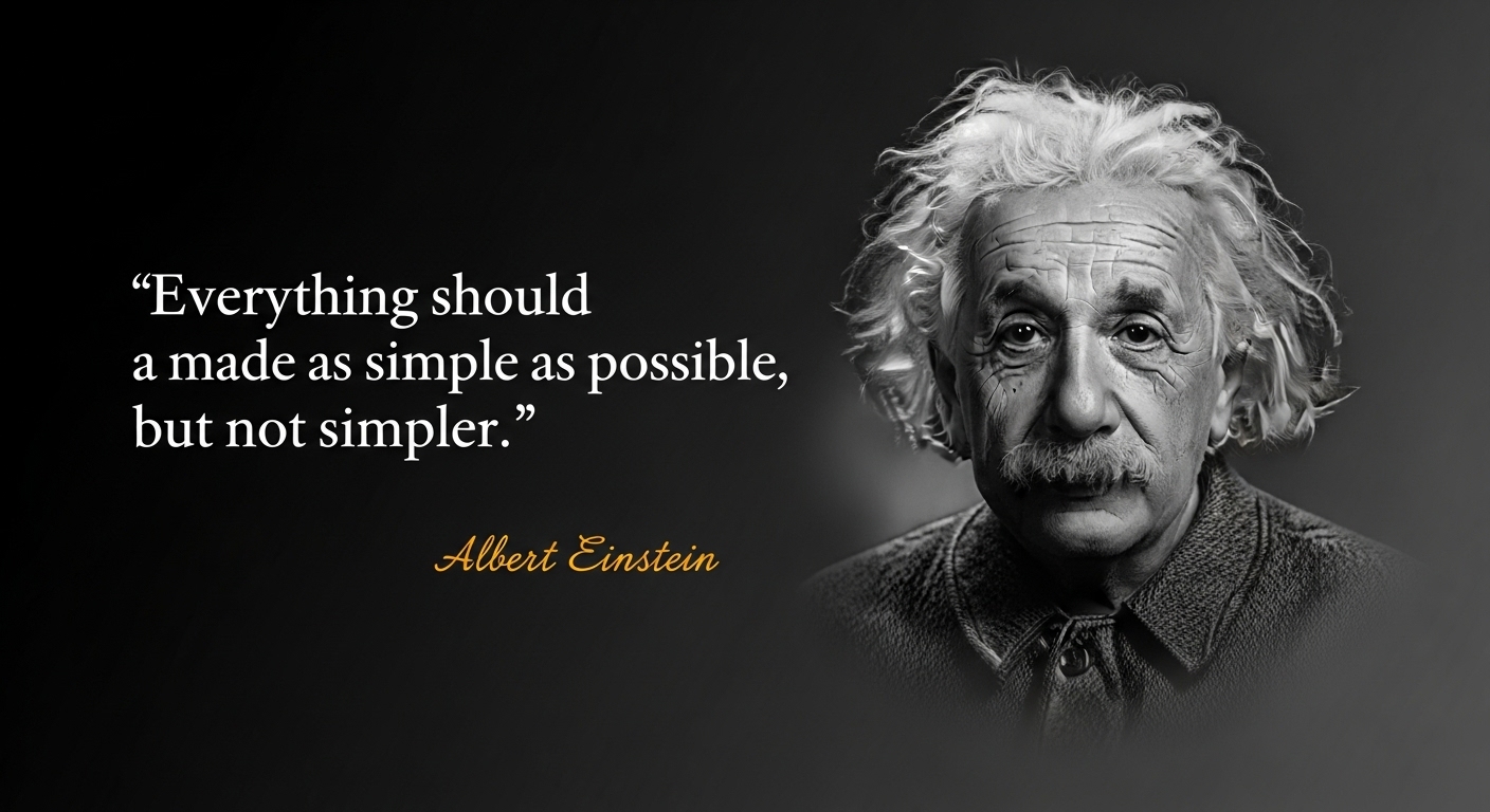 Note: You may have heard this quote. Einstein didn't actually say this, but he did say something similar. But the point is not to strip away everything. It's to strip away everything that isn't important. Which means you might have very complex figures, and that's OK. --- ## 4. Fit the message to the audience Manuscript ≠ Slides Note: Matching the message to the capacity of the audience ensures that they don't get overloaded. The context matters: in a presentation, you have to simplify. In a full paper, you can include more details. --- <img src="/slides/speaking-visually/sheffield2017_fig2.png" height="700"/> Note: Example of a figure in one of my papers --- <img src="/slides/speaking-visually/within_ews_heterogeneity_top.svg" style="margin-bottom:0"/><img src="/slides/speaking-visually/within_ews_heterogeneity_bot.svg" class = "fragment" style="margin-top:0"/> Note: Here's how I distilled that down to a slide. Notice: It's a single panel from the figure, and I even used fragments to guide the audience with that panel. --- ## 5. Build visual rhythm Familiarity facilitates recall (Consistency, Small multiples) Note: Familiarity decreases cognitive load. --- ## 5. Build visual rhythm 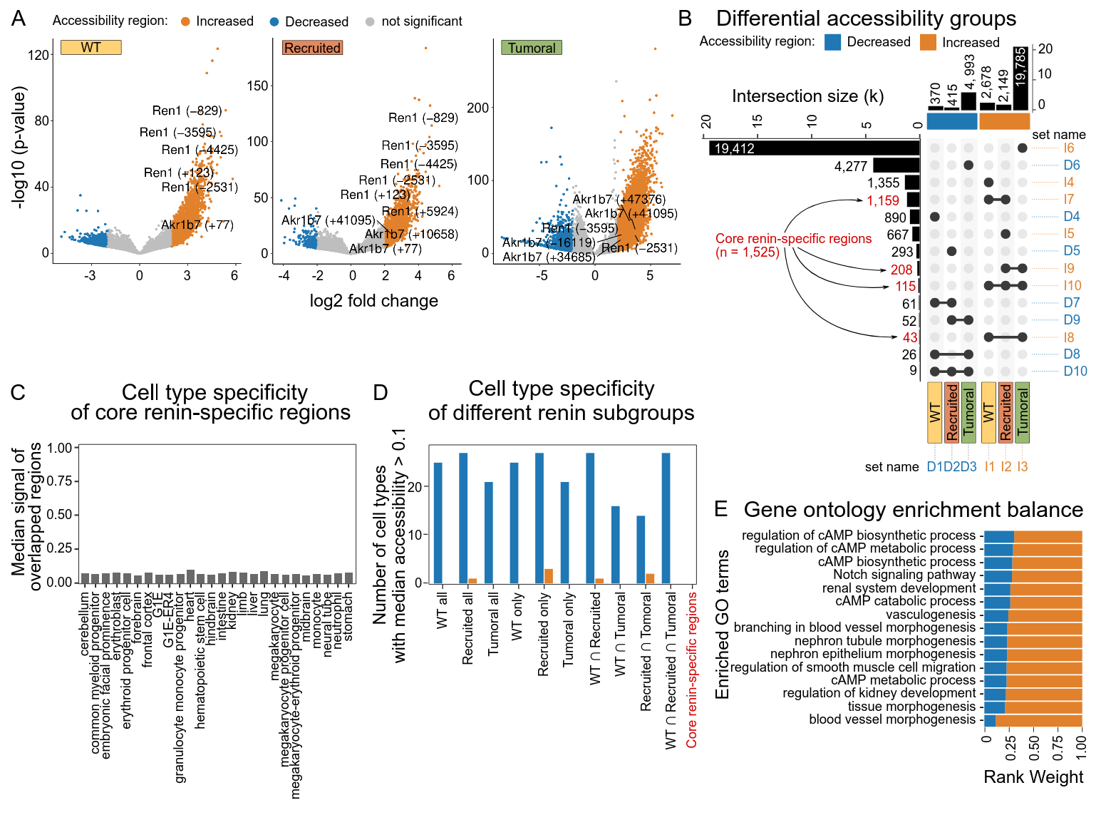 Note: In her first figure, Bing establishes a color pattern: Orange means increased, Blue means decreased. Also, she creates a visually consistent representation of the cell type. --- ## 5. Build visual rhythm 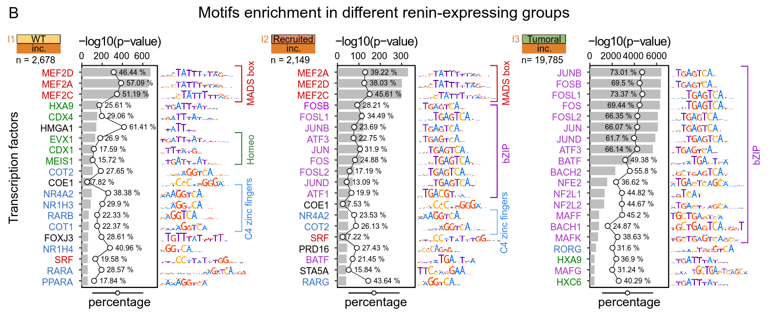 Note: These are re-used across figures in the paper. --- ## 5. Build visual rhythm 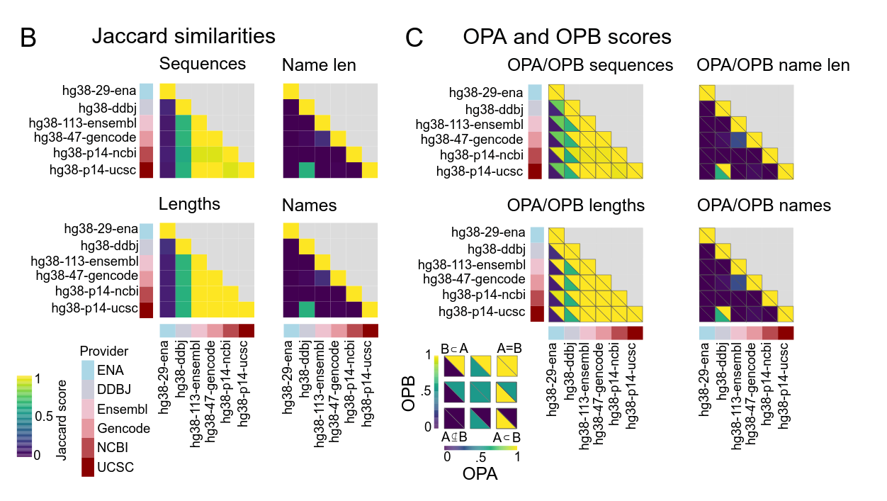 Note: In Donald's paper, he establishes a complex icon and plot type, which shows up multiple times in this figure. --- ## 5. Build visual rhythm  Note: The same type of plot shows up in the next figure. The reader doesn't have to re-learn how this plot works. --- ## Key message 1. Communication means getting through. 2. Getting through means reducing cognitive load for the recipient. ---  If you don't understand the mind of the message receiver, your message won't get through. Note: You can understand your message perfectly, but if you don't understand the mind of the message receiver, it won't get through. Messages must be crafted in the context of their recipients. --- <style> #acknowledgements { height: 100% !important; display: flex !important; flex-direction: column !important; justify-content: center !important; } </style> <section id="acknowledgements" data-background="/images/presentations/bg.svg.png"> # Thank You <br clear="all"/> <span class="small bullet"><img src="/images/external/github_bug_black.svg" height="20" class="bullet"><a href="http://github.com/nsheff">nsheff</a></span> · <span class="small bullet"><img src="/images/icons/web.svg" height="25" class="bullet"><a href="http://databio.org">databio.org</a></span> · <span class="small bullet"><img src="/images/icons/letter.svg" height="25" class="bullet"><a href="mailto:nsheffield@virginia.edu">nsheffield@virginia.edu</a></span> <div class="bullet" style="background-color:rgb(45,45,45,.65); border-radius: 25px; opacity:0.9"> <img src="/images/external/uva_dgs_logo.svg" height="65"> <img src="/images/logo/logo_databio_long.svg" height="45"> </div> </section>